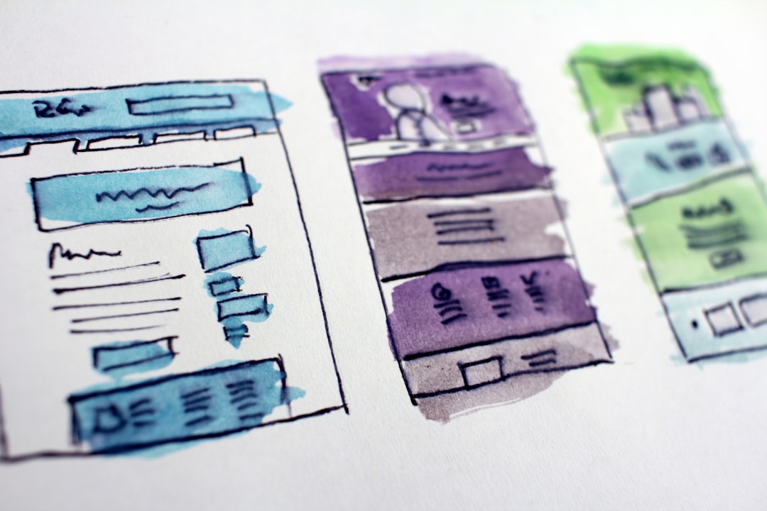
A landing page is essentially a one-page website that guides users toward a specific action. An effective landing page can help you reach your bottom line by generating leads through email marketing and social media campaigns. Using the right design elements has a huge impact on converting leads into sales. Take a look at some key design elements for beginners looking to create an effective landing page.
1. Visual Simplicity

Maintaining visual simplicity by using a minimalist design better highlights your value-added proposition and helps your visitors focus. A visually simple template utilizes whitespace to make it easier for key features and calls to action to stand out to users. It allows you to create contrast in how you display elements while maintaining a design flow that encourages users to keep reading.
A great way for beginners to create an effective landing page is to use a comprehensive design template. Lucid Press offers a comprehensive gallery of lockable brand templates that can be customized to fit your branding. Locking down fonts, images, logos, and position eliminates the risk of accidental stretching, moving, and discoloration. At lucidpress.com you can find several free Instagram templates and examples that feature an intuitive editor that allows you to add your own images, color palette, and copy. Using a pre-made layout ensures brand and content consistency and makes a huge impact on your brand’s scalability and bottom line.
2. The Power of Color

An important design element in a landing page template is the use of an appropriate color palette. An effective color palette combines different colors that are complementary and opposite. Using high and low colors creates high contrast and improves copy readability. Considering the psychology of colors and how they affect marketing is a smart way to use the right colors that will convey your message. It’s also important to understand color symbolism and how different demographics and cultures interpret colors.
3. Catchy Headers

The best way to effectively engage with visitors and encourage site click-throughs is to create a catchy headline that hooks visitors. Your headline is the first impression visitors get of your brand, which means it should clearly convey your message and your unique selling proposition. You can further highlight your value proposition by leveraging your subheadings and further explaining your offering.
For example, a health insurance plan gives you access to reliable health care but finding the right health plan is complicated. With so many health insurance providers offering different plans, it’s difficult to determine the right type of coverage for your needs. The best way to find a health insurer is to compare the available plans offered by various network providers. A site that’s helping people find the right health insurer should have engaging headers that call out to potential readers.
Here you can read Aetna vs United Healthcare reviews to learn about the pros and cons of each insurance company. The insurance website features comparison reviews that break down health plan essentials, such as copayments, prescription drug coverage, preventative care, coverage for hearing aids, dental care, and the ability to choose your favorite primary care physician. By comparing and contrasting the value-added propositions of different healthcare providers, you can make an informed decision about which health insurance company is right for you.
4. Responsive Design

Whether visitors are using a computer, tablet, or mobile device, it’s imperative that your website, landing page, and mobile app feature a responsive design. Most design templates come with integrated responsiveness. Creating a responsive landing page ensures feature and content consistency, caters to increased web traffic from tablets and mobile devices, integrates with SMM campaigns that generate web traffic, and makes it easier to build due to reduced layout complexity.
5. Strong Calls to Action

A call to action button serves as the gateway between your offering and the visitor. A strong landing page emphasizes your primary CTA and makes it easy for visitors to complete the desired action. Using engaging images, visual cues, and vivid colors will help your CTAs stand out and guide visitors. You should use natural and actionable phrases that encourage visitors to click and learn more.
The key design elements of an effective landing page include visual simplicity, an appropriate color palette, a catchy headline, responsive design, and strong calls to action.


